

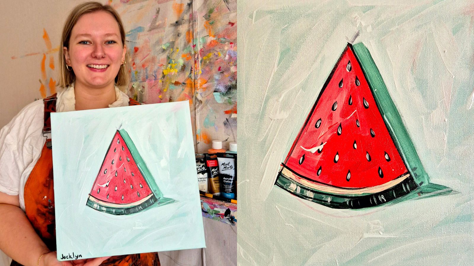


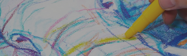
Painting a portrait can seem like a daunting project, but it is actually a fun activity that anyone can enjoy. By adopting the few simple techniques listed below, you’ll be on your way to portrait painting in no time!
After settling on a subject matter and picking a strong reference image, it’s time to begin. Some fun subjects to discover the world of portrait painting could include:
- Self portraits
- Pet portraits
- Traditional portraits
Now let’s get going!
Prep
For those that want some structure to follow when creating your portrait – we got you! The first thing to remember is you don’t have to make it picture-perfect – you can exaggerate the proportions in your grid for a more stylised piece – art is all about expressing yourself!
Before laying down colours, we recommend drawing out a basic outline of your portrait to give yourself a guideline and set the tone for your piece. If you’re adopting an exaggerated style, map that out early in the piece to make sure you don’t lose yourself in the paint. If you’re opting for realism, make sure you can see the resemblance and nail the proportions in your grid before setting off with colour.
Tip: The grid portrait method is a great way to map out your reference. Just ensure your canvas, paper, or the chosen base has the same dimensions as your reference picture (e.g., A4 reference picture = A4 canvas or paper). Then draw a grid onto the picture and the project base, allowing you to tackle the project square by square!
Flesh tones
The four base colours you’ll need for making believable skin tones are red, yellow, blue, a couple of browns, and white. If the goal is realism, take note of the hue of your reference’s skin tone (i.e., warm, cool, or neutral) to determine the kinds of colours and amount of each you need.
Mixing primary colours will create a brown, which you can change the undertone of with different quantities of blue, yellow, and red. Adding white as well as brown shades can change how light or deep the colour is, with the goal being to match your reference pic! Have a go at using different amounts of each colour to create a range of skin colours from lighter to darker so you feel comfy with the process.
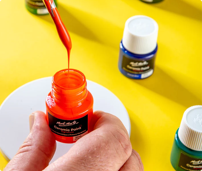
The actual paint colours are up to you but we do have a couple of specific shades we recommend using for the most realistic flesh tones. We’ve provided a couple of notes as to which are the brighter colours and which are more neutral but remember their combination is up to you and is worth playing around with.
- Titanium white
- Cadmium yellow (bright) or yellow ochre (neutral)
- Cadmium red (bright) or scarlet (neutral)
- Ultramarine blue (bright) Prussian blue (neutral)
- Burnt sienna (warm brown)
- Raw umber (neutral brown)
The exact colours listed are found in our oil paint range, but if you’re using another medium, just use these colours as a reference point when sourcing the same shades in your chosen medium 😊
Colour theory
Before getting stuck in, it’s a good idea to mix up a few of the main colours that you will use in the piece. Colour matching is made easy with colour theory – recently seen to have blown up across TikTok in the makeup and fashion spaces.
Here are some tips to make your colours sing:
- Look at a colour wheel (we sell these here) while working so you can visualize which colours complement each other – a colour’s complement is on the opposite side of the colour wheel.
- Complementary colours can be used to darken and lighten each other (e.g., add a teensy bit of blue to orange, and you get a deeper orange). Tip: be careful as you can create browns and greys fairly easily so use a light hand.
- Create dynamic highlights and shadows by placing complementary colours next to each other. For example, use a very light lilac on the tip of a yellow-undertone portrait’s nose to make a highlight that pops!
- Mixing two complementary colours and then adding a touch of blue or green can create beautiful shadows that glow from within.
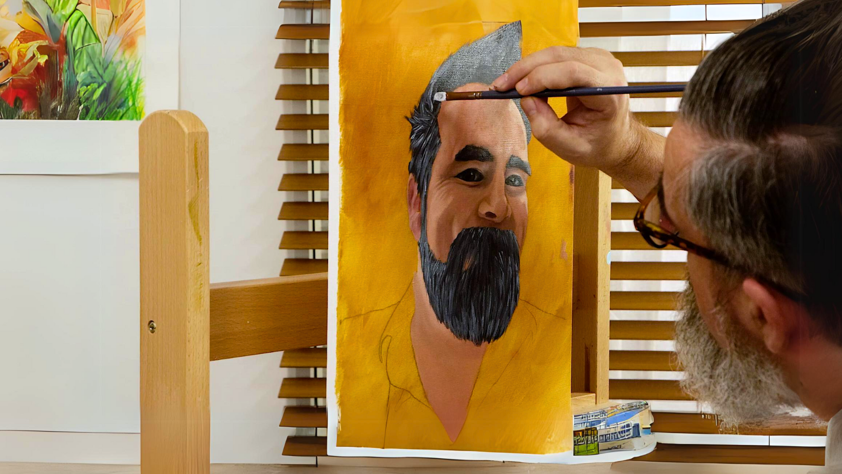
Paint the tones in order
It’s a good idea to paint the tones (i.e., the shades of light and dark) in a particular order to create optimal clarity and reduce muddiness. It also gives you a process to follow which can help when starting out.
It’s best to start with the dark tones, before moving on to the mids, and then finally the light tones. This ensures highlights are on the surface making them nice and bright! Similarly, layering mid tones over the dark tones creates depth and dimension in the piece.
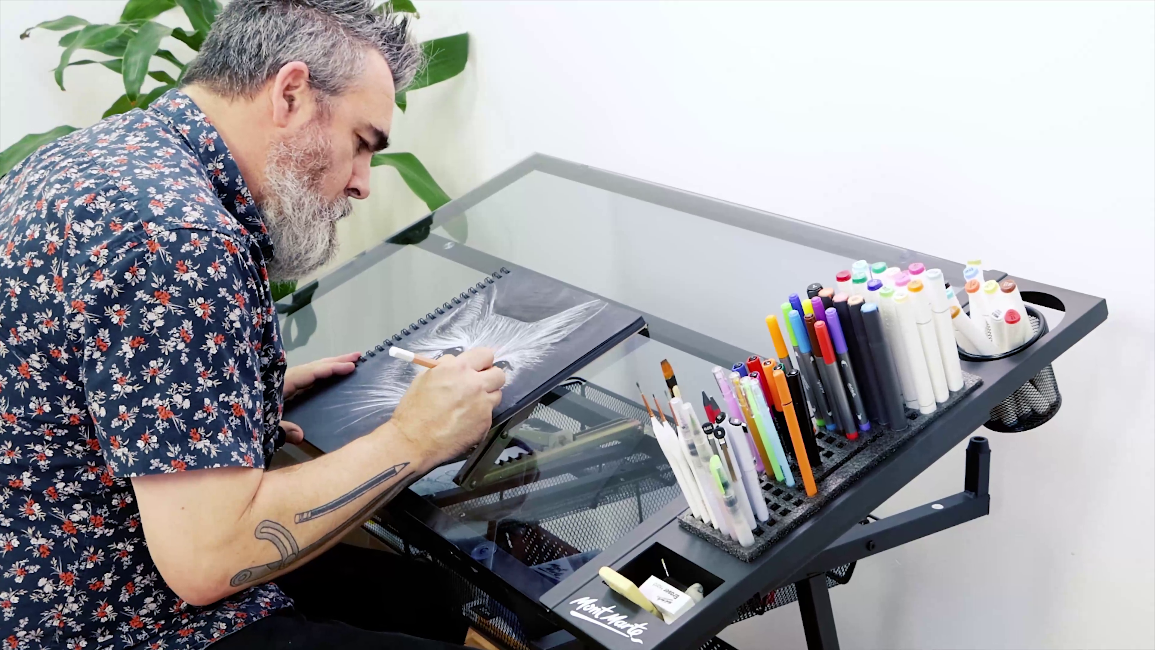
Texture & details
Different mediums offer different textures and can create diverse dimensions when completing the details of a portrait’s hair, skin, and clothes. You can create 3D texture on your canvas or paper with mediums such as oil, which can hold their shape when drying, albeit slowly! This means if you spread the paint on thick it will dry thick and won’t level itself out to dry flat like acrylic paint will.
Something to note: mediums such as Impasto and Texture Gel can be added to acrylic paint to ensure it holds its shape when drying as well – how cool!
Whether your medium dries flat or not, the key to creating realistic texture is by layering light and dark tones. Highlight the elements exposed to light in your reference picture and create depth by darkening elements sheltered from light in the image. Contrast is key and layering these lights and darks creates believable texture.
Remember that the level of dimension in your piece is entirely up to you and there is no right or wrong. Your style may be more playful with fewer highlights and shadows – think of a cartoon – and that is still a winning portrait approach!
Finishing
Finish the final details like fine hairs, clothing texture, and your background. You can make them picture perfect or stylise them to suit your vibe - it's completely up to you!
Let your epic creation dry completely before deciding if you would like to seal it. Sealing your portrait can protect it from fading in light, stop it from smudging, and can create a different finish (e.g., glossy vs. matte). We even have an iridescent one for a dreamy, shimmery finish!
A finishing seal is typically a varnish or a spray, but you can also mix a medium into your paints during the actual painting process to create matte, glossy, and more vibrant finishes.
We hope that you feel inspired to adopt some of these techniques and start tackling portraits in your creative pursuits. No matter what your portrait looks like, remember that every artist is unique, and no two brushstrokes are the same – that is what makes art so inspiring. Anyone can be an artist.
So, when you paint your next portrait, remember this: no one has ever created what I am about to create so I might as well have fun with it! There is only one you and that’s kind of awesome.
If you make something, #montmarteart or tag us @montmarteart on Instagram or Facebook. We’d love to see what you create.
Looking for more? Check out our Artist Gallery for some inspiration. If you need supplies or want to experiment with one of the mediums mentioned, jump online to check out our Paint collection.


