


Sir Isaac Newton invented the original colour wheel by splitting white sunlight into red, orange, yellow, green, cyan, and blue beams. Colour wheels have been consulted by many artists as to the best colour composition for their artwork, depending on the feel, mood and look they wanted to achieve. We’ve listed further down all the colours and their uses in art, branding, technology as well as their effects - from making you feel hungry to calm - so you can arm yourself with this knowledge the next time you’re planning your painting’s composition and scheme.
We’ve listed further down all the colours and their uses in art, branding, technology as well as their effects - from making you feel hungry to calm - so you can arm yourself with this knowledge the next time you’re planning your painting’s composition and scheme.
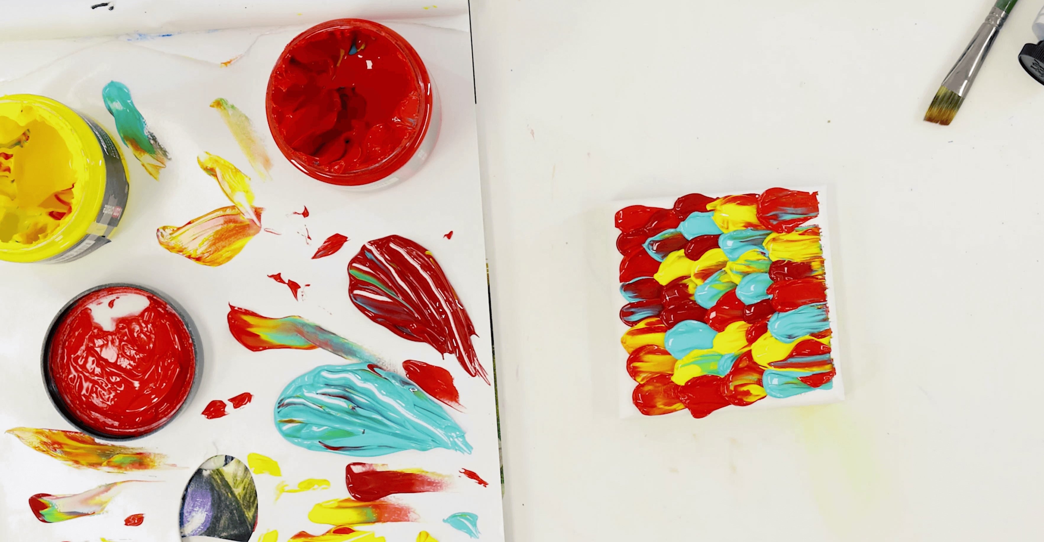
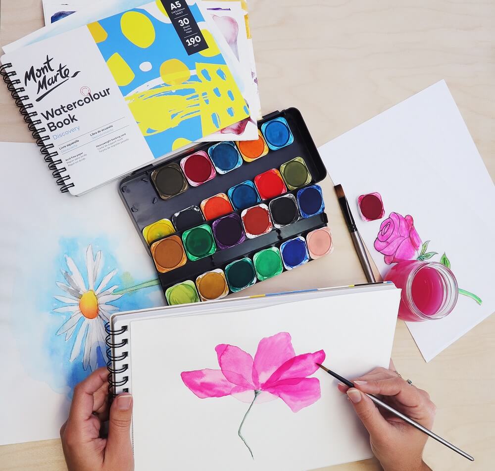
Also, below is a review of primary, secondary and tertiary colours as well as how to implement colour in your painting and artwork.

Understanding the Colour Wheel:
A standard colour wheel has 12 colours. They are (in clockwise direction) Yellow, Yellow- Orange, Orange, Red-Orange, Red, Red-Violet, Violet, Blue-Violet, Blue, Blue-Green, Green and Yellow Green.
There are 3 Primary Colours, which make up the most powerful colours on the wheel and are the most important - Yellow, Red and Blue. Mix any 2 of these primaries together and you get a Secondary Colour. The secondary colours are Orange, Violet and Green, and they fall between the primaries.
The 6 remaining colours that occupy the wheel are referred to as Tertiary Colours. These are Yellow-Orange, Red-Orange, Red-Violet, Blue-Violet (Purple), Blue-Green (Turquoise) and Yellow-Green (Chartreuse).
Colours opposite one another on the wheel are complementary to one another. One half of the wheel is warm (reds and yellows) and the other side is cool (blues and greens).
How to Use the Colour Wheel with Your Artwork:
-
Use Complementary Colours next to one another as this will enhance each colour and make it more vibrant.
-
Use Split Complementary Colours (the two colours adjacent to its complementary colour) in colour groupings; for example if you are painting a field of red flowers, use green and blue as its split complementaries for a lovely colour scheme.
-
Use a Triadic set of colours in a painting (any three colours located equally around the colour wheel from each other) for an equally eye catching scheme.
-
Use a Tetrad grouping of colours in your work (4 colours on the wheel which are two sets of complementary colours not involving your selected colour).
-
A monochromatic colour combination (consisting of only 1 colour) includes tints, tones and shades of that colour as gradients.
-
Use an Analogous colour grouping (this uses 5 colours adjacent to one another on the colour wheel).

How to Use Colour to Show Emotion:
Below is an all encompassing insight into the meaning behind each colour.
Red:
Red is the colour of fire and blood, so it is associated with energy, war, danger, strength, power, determination as well as passion, desire, and love.
Red is a very emotionally intense colour. It enhances human metabolism, increases respiration rate, and raises blood pressure. It has very high visibility, which is why stop signs, stoplights, and fire equipment are usually painted red.
In heraldry, red is used to indicate courage. It is a colour found in many national flags.
Light red represents joy, sexuality, passion, sensitivity, and love.
Pink signifies romance, love, and friendship. It denotes feminine qualities and passiveness.
Dark red is associated with vigor, willpower, rage, anger, leadership, courage, longing, malice, and wrath.
Orange:
Orange combines the energy of red and the happiness of yellow. It is associated with joy, sunshine, and the tropics.
Orange represents enthusiasm, fascination, happiness, creativity, determination, attraction, success, encouragement, and stimulation.
Orange increases oxygen supply to the brain, produces an invigorating effect, and stimulates mental activity.
As a citrus colour, orange is associated with healthy food and stimulates appetite. Orange is the colour of fall and harvest.
Orange has very high visibility, so you can use it to catch attention and highlight the most important elements of your design.
Orange is very effective for promoting food products and toys.
Dark orange can mean deceit and distrust.
Red-orange corresponds to desire, sexual passion, pleasure, domination, aggression, and thirst for action.
Yellow:
Yellow is the colour of sunshine. It's associated with joy, happiness, intellect, and energy.
Yellow produces a warming effect, arouses cheerfulness, stimulates mental activity, and generates muscle energy.
Yellow is often associated with food. Bright, pure yellow is an attention getter, which is the reason cabs are painted this colour.
Yellow is seen before other colours when placed against black; this combination is often used to issue a warning.
Use yellow to evoke pleasant, cheerful feelings.
Yellow is very effective for attracting attention, so use it to highlight the most important elements of your design.
Avoid using yellow if you want to suggest stability and safety.
Light yellow tends to disappear into white, so it usually needs a dark colour to highlight it.
Shades of yellow are visually unappealing because they lose cheerfulness and become dingy. Dull (dingy) yellow represents caution, decay, sickness, and jealousy.
Light yellow is associated with intellect, freshness, and joy.
Green:
Green is the colour of nature. It symbolises growth, harmony, freshness, and fertility.
Green has strong emotional correspondence with safety. Dark green is also commonly associated with money.
Green has great healing power. It is the most restful colour for the human eye; it can improve vision.
Green suggests stability and endurance.
Green is used to indicate safety when advertising drugs and medical products.
Green is directly related to nature, so you can use it to promote 'green' products.
Dark green is associated with ambition, greed, and jealousy.
Yellow-green can indicate sickness, cowardice, discord, and jealousy.
Aqua is associated with emotional healing and protection.
Olive green is the traditional colour of peace.
Blue:
Blue is the colour of the sky and sea. It is often associated with depth and stability.
It symbolises trust, loyalty, wisdom, confidence, intelligence, faith, truth and heaven.
Blue is considered beneficial to the mind and body. It slows human metabolism and produces a calming effect. Blue is strongly associated with tranquility and calmness.
As opposed to emotionally warm colours like red, orange, and yellow; blue is linked to consciousness and intellect.
Use blue to suggest precision when promoting high-tech products.
Dark blue is associated with depth, expertise, and stability. When used together with warm colours like yellow or red, blue can create high-impact, vibrant designs; for example, blue-yellow-red is a perfect colour scheme for a superhero.
Light blue is associated with health, healing, tranquility, understanding, and softness.
Dark blue represents knowledge, power, integrity, and seriousness.
Purple:
Purple combines the stability of blue and the energy of red.
Purple is associated with royalty. It symbolises power, nobility, luxury, and ambition. It conveys wealth and extravagance.
Purple is associated with wisdom, dignity, independence, creativity, mystery, and magic. Purple is a very rare colour in nature.
Light purple is a good choice for a feminine design, it evokes romantic and nostalgic feelings.
Dark purple evokes gloom and sad feelings. It can cause frustration.
White:
White is associated with light, goodness, innocence, purity, and virginity. It is considered to be the colour of perfection. White means safety, purity, and cleanliness. As opposed to black, white usually has a positive connotation. White can represent a successful beginning.
In advertising, white is associated with coolness and cleanliness because it's the colour of snow. You can use white to suggest simplicity in high-tech products.
Black:
Black is associated with power, elegance, formality, death, evil, and mystery. Black is a mysterious colour associated with fear and the unknown (black holes). It usually has a negative connotation (blacklist, black humour, 'black death').
Black denotes strength and authority; it is considered to be a very formal, elegant, and prestigious colour (black tie, black Mercedes).
Black gives the feeling of perspective and depth, but a black background diminishes readability.
Black contrasts well with bright colours. Combined with red or orange – other very powerful colours – black gives a very aggressive colour scheme.
Colour Meanings copyrighted to Color Wheel Pro.


